
Have you ever tried to design your own character and realised how tricky the process can be? A lot of work goes into a good character design so it can be difficult to know where to begin Luckily, there are a few simple character design tips you can use to greatly improve your designs!
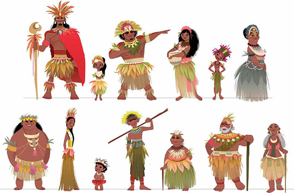
Character design has always had a key role in the concept-design industry. Whether you are designing for film, TV, games, advertising, or a personal project it takes a lot of creativity and skill to create an effective character.
To understand what great character designs look like, one only has to look at the work of well-known mass-media company Disney, whose iconic characters remain common household names, despite some of them being introduced as early as the 1930s.
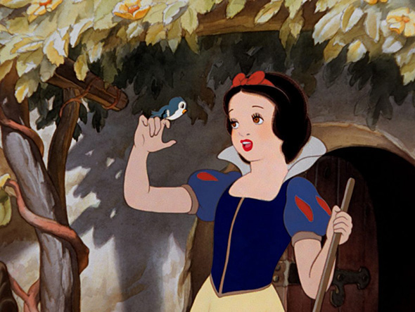
However, Disney is just one example – there are many styles that can be used to create effective characters as long as you know how to use these styles. So here are 39 character design tips and tricks to help you create your own awesome characters!
Whether you are using Adobe Illustrator, Photoshop, Procreate, or any other software or medium, your character design process will start in the same place!
Every character design begins with an idea. This idea can often be in the form of a client brief or even a personal project!
Sometimes finding inspiration for your designs can feel impossible! But don’t fret, there are a bunch of different ways to unlock your creativity.
Looking at the amazing works of your favourite artists can really help improve your creativity and give you new techniques and ideas to try in your own work.
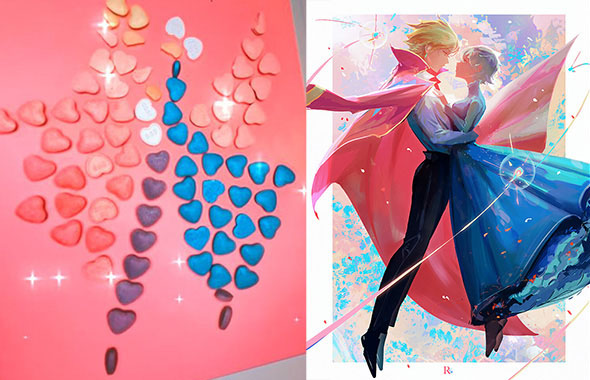
For example, talented artist Ross Tran, aka @rossdraws, is well-known for his digital paintings in which he takes images of himself or everyday objects and turns them into a fantastical scenes. In the below image, he used heart candy as inspiration for some beautiful character art. Why not give this a try using objects from your own house?
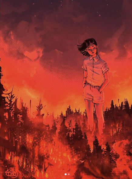
Music can be another awesome creative outlet and because of this, many artists find music incredibly inspiring when creating character designs. For example take this drawing by @the.flightless.artist, Isabel Burke. Isabel has turned the song ‘A Burning Hill’ by Mitski into this gorgeous design!
So, grab your headphones and listen to your favourite playlist. Try to find songs that remind you of your character and let the lyrics and melodies inspire you!
When was the last time you went to an art gallery? Both traditional and contemporary art can be a great inspiration when creating character designs.
A lot of art galleries offer free entry. So go find a local gallery and go check out the works they have on display! Pay attention to the different styles, textures, and colours other artists are using, and start thinking about what techniques you can incorporate into your own designs.
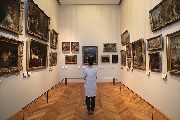
Sometimes the best remedy for an art block is to take a break from your work and do something relaxing. The outdoors provide endless forms of inspiration, from people you see around town to the beautiful natural environment.
So, if you are struggling to pin down the final concepts for your design, take a walk and see what new ideas you can find!
Once you have a character idea in mind, your next step should be to start researching. Ask yourself questions like:
What is my character’s context? How does it look where they live? What would they wear for this climate? What time do they live in? What is their socio-economic status and how would this affect their design?
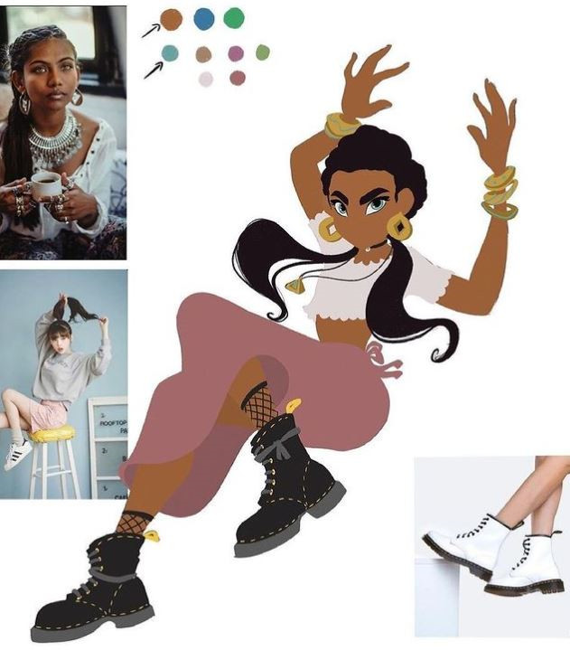
Once you have answered these questions, try to find as much written and visual information as possible. Compile mood boards and notes from your findings.
A well-researched character will have a lot more credibility and really resonate with their audience. When you are finished researching, you should have enough reference material to start designing your character.
A good example of how to use your reference images can be seen in this example from our ‘How to Draw a Cartoon Character Course’ by Maria Lia Malandrino.
A key part of creating good cartoon characters is having a strong understanding of form and anatomy. Some exercises to improve your skills include:
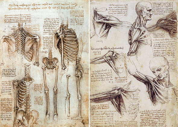
Life studies are an age-old artistic practice that is incredibly effective for improving your character design skills. An example of this is the anatomy studies of Leonardo Da Vinci. Da Vinci was dedicated to gaining a comprehensive understanding of the human form to improve his work.
When you design a character, there is a tonne of different archetypes that you can draw inspiration from. Utilising these well-known character types allows your designs to be easily understood by their audience. Many character designers utilise archetypes in their designs!
Randy Bishop’s course, ‘Fundamentals of Character Design’ does a great job of going into detail on all these archetypes and how to use them in your designs.
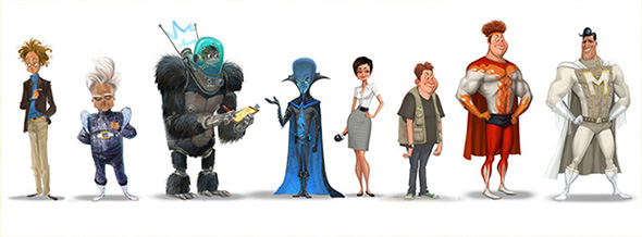
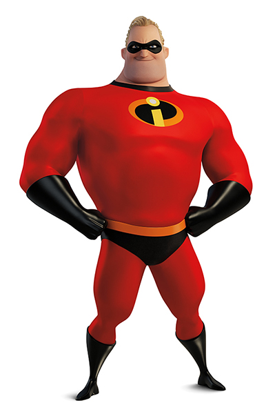
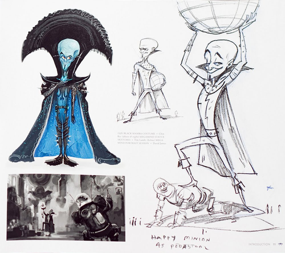
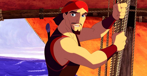
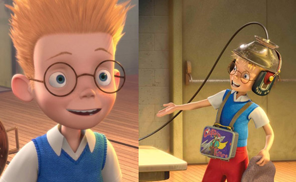
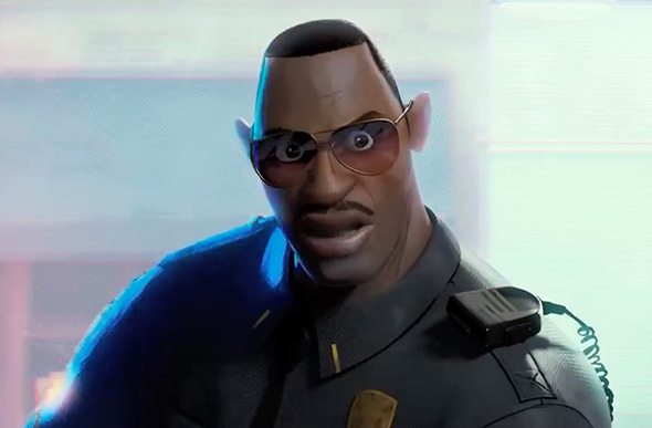
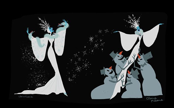
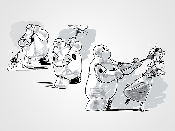
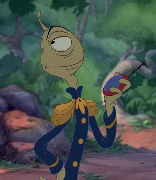
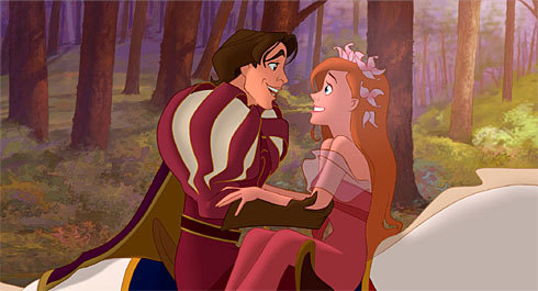
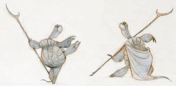
Once you are aware of these archetypes you will be able to create designs that will clearly communicate your character’s personality. If none of these categories feel quite right for your character, you can always combine multiple tropes, or subvert them completely to create endless unique designs!
When you design a character it is important to know who your audience is. For example, a design that appeals to children may not always appeal to adults or vice versa. So before you start your design, take a moment to think about your audience. How old are they? Are they any gender in particular? Where do they live? Answering these questions will allow you to cater your designs more toward your audience and therefore ensure your character is engaging.
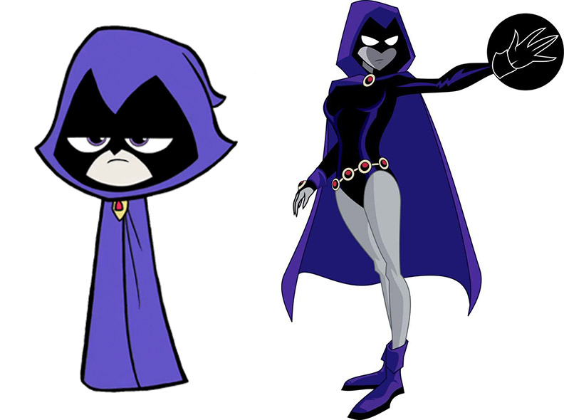
Take a look at these two designs of Raven from Teen Titans. The first design is aimed at younger children whilst the second is aimed at teenagers. As you can see, more simplified designs are preferred when designing for younger viewers.
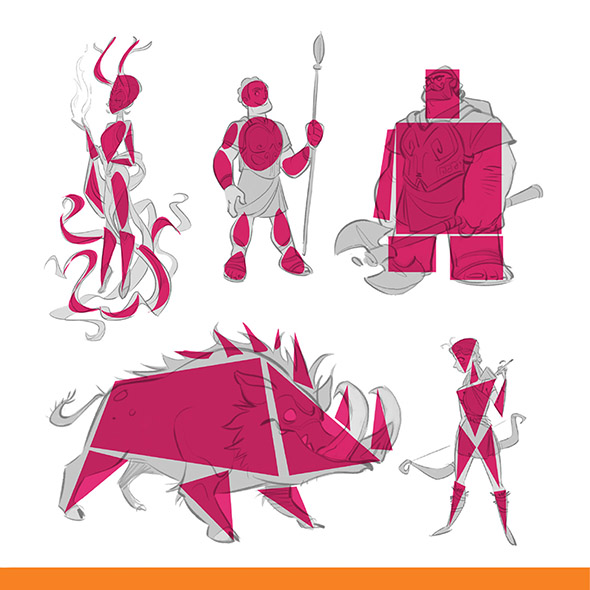
Shape language is a technique that communicates information about your character by using basic shapes that our brains are familiar with. The primary shapes you pick will decide a lot about how your audience will view your character, so it’s important to take each shape’s meaning into consideration.
21 Draw’s amazing art book ‘The Character Designer’ is a great resource if you want to learn more about how to use this technique effectively in your work!
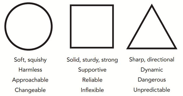
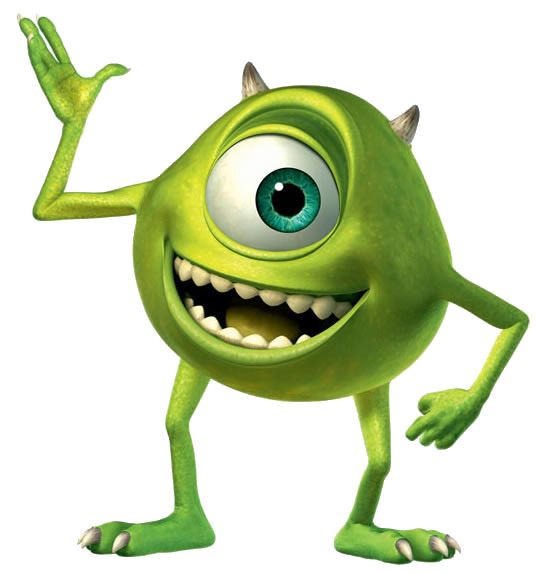
Circle: Characters who use circular shape language are usually friendly and outgoing- the kind of characters you really just want to hug. This shape is perfect for caregivers, children, and other gentle, innocent characters.
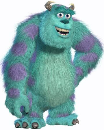
Square: Square shape language is great for strong, dependable, and confident characters. The cool thing about this shape is that it can be used to create really intimidating characters or very comforting ones depending on how you use it. You will often find squares used in characters such as heroes, fathers, and other characters with similar paternal roles.
Triangle: Well-known as the evil shape, triangles are usually used in the designs of antagonist characters. Triangular shape-language can look quite aggressive which is why these characters are often considered to be sinister and unpredictable. It is important to note, that the more stretched the triangular shapes the more menacing your character will look!
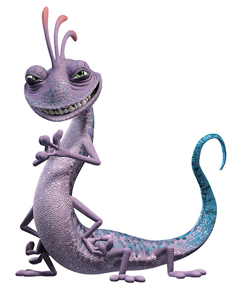
Note: Your character does not have to include only one of the three shapes! More complex characters will often be a combination of the two shapes they most represent! For example, your character may be both strong and kind, or evil and confident.
There are a lot of different factors that contribute to the effectiveness of a character design. Here are a few character design tips to help you create good character designs every time!
First up, let’s talk about thumbnailing. When you first design a character, it is super important that you create multiple different iterations. These should be small sketches and are usually referred to as design thumbnails.
Creating multiple sketches of your character allows you to fine-tune your design as it helps you identify the most effective elements in each iteration.
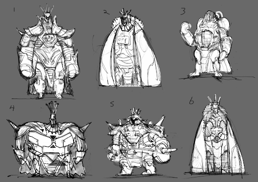
This process is something that a lot of professional character designers use to improve their work. As you can see in these concept art thumbnails of ‘Obsidian’ by concept artist Andrew Erickson, thumbnailing is an awesome technique for testing out a range of ideas for your design.
When creating memorable characters it is super important to think about what you are trying to communicate with your design. A few factors you will need to consider are character exaggeration, costume, and props.
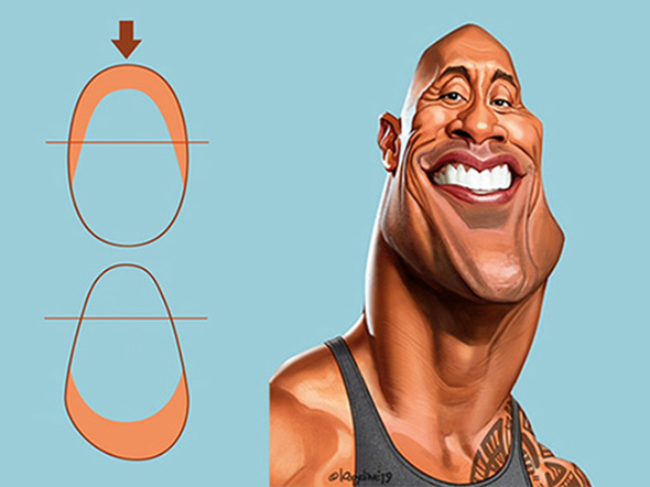
If you want your characters to have a strong and lasting impression on their audience it is important to utilise exaggeration in your designs. Consider what parts of your character can be emphasized and which parts can be simplified to best convey their personalities.
A good character design is one that can be transferred into a very simplistic style and still be identifiable- examples of this include the designs of most popular superheroes- which have easily readable features no matter the style they are drawn in!
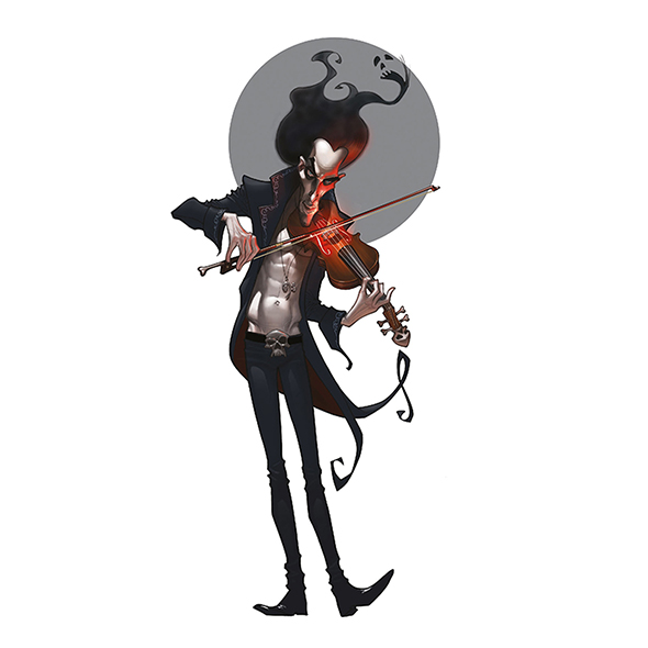
To decide which parts of your character to exaggerate try identifying the primary traits of their personality and storyline. Maybe your character is a shy and really good listener so they have big ears and a smaller mouth.
Or perhaps your character is going on a journey but they are anxious and try to over-prepare, so they have a comically large back-pack. The possibilities of exaggerated features are nearly endless and depend completely on what you want to emphasize about your character.
A good way to work on building your exaggeration skills is to practice creating caricature-style drawings from real-life references. ‘Drawing Caricatures’ by LoopyDave is a great resource for those looking to give this a try!
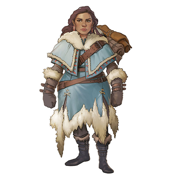
A character’s costume and props can be vital to the effectiveness of your design. A good character design is one with a well-considered costume that heavily reflects both their personality and context.
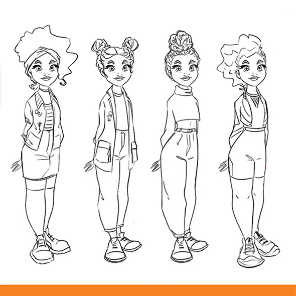
Before you even start designing your character’s clothing, first do some research into where they live and the type of activities your character will need to perform. A good costume will be functional within the character’s setting.
This can be a bit tricky when you are just starting out. Luckily, ‘Digital Illustration for Beginners’ by Laia Lopez, will provide you with the perfect introduction to costume design for characters!
Ask yourself questions like: Do they live in a cold climate? Do they require any special clothing or props to live there? Are their clothes suitable for their occupation? Etc. Once you have researched all these factors you will be able to move on to adding some personality to the costume design.
What colours does your character like? What do they represent about the character? The colours, patterns, textures, and shapes you use in your character’s clothing have the potential to communicate a lot about your character.
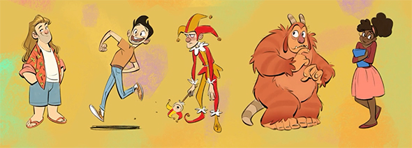
When you create characters it is important to consider what your character’s overall disposition will be. To decide on this, think about what type of behaviors your character would default to on an average day. Are they shy, confident, brave, outgoing, lazy, hard-working, or any other basic overall personality you can think of? Understanding your character’s personality will help you choose better poses and expressions when illustrating!
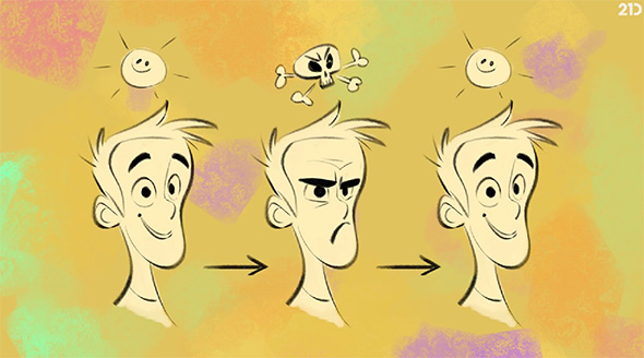
While personality is static, a character’s emotions can always change. This is something that should be represented in your designs. For example, a character who is usually confident will still have moments when they are feeling shy, depending on their circumstances.
Each character will express their emotions differently, so it’s important to consider this when you are choosing facial expressions!
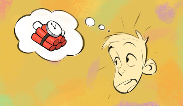
Just like any real person, your characters should have things that they really want to obtain or achieve. These desires will make them much more interesting for your audience, as they give your characters something to work towards!
A character’s desires will determine what actions they are likely to perform, making it a lot easier to choose key poses to illustrate your character.
To learn loads more about creating emotive characters with well-defined personalities, check out ‘Creating Expressive Characters’ by character designer Kenneth Anderson!
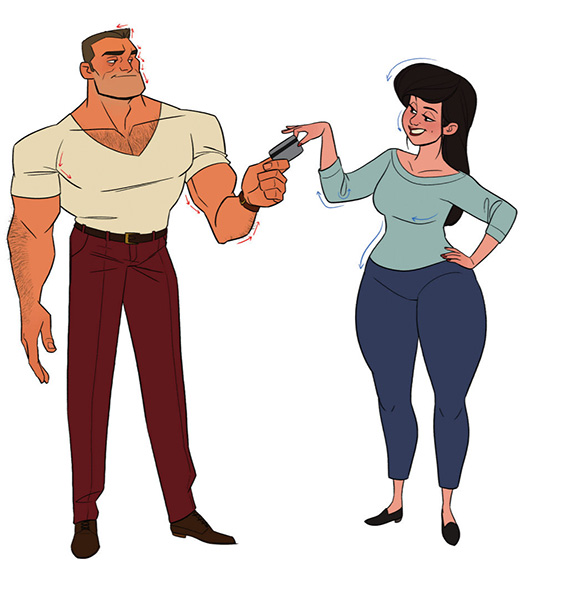
When designing your characters it is helpful to understand some of the key differences between male and female proportions and shape language.
A good way to gain an understanding of these differences is to frequently study photographic or real-life references. Though everyone’s proportions are totally unique to themselves and not everyone fits under these gender categories, there are a few basic rules you can apply to your work to make your characters appear more masculine or feminine.
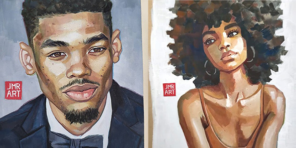
When it comes to illustrating faces, there are a few key differences between masculine and feminine faces. When compared to a females face, a male face will tend to have:
Compared to masculine faces, females generally have:
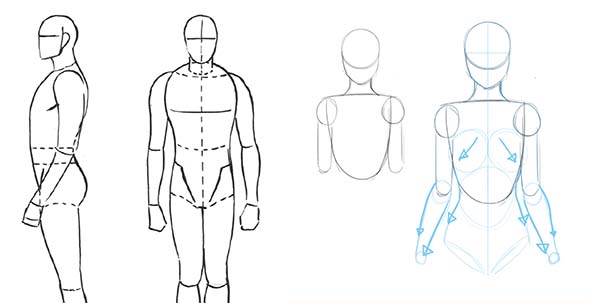
Due to varying hormone levels, men and women are going to have different body compositions. Especially when it comes to where we are likely to hold fat and how we gain muscle. Some important things to note when it comes to this are:
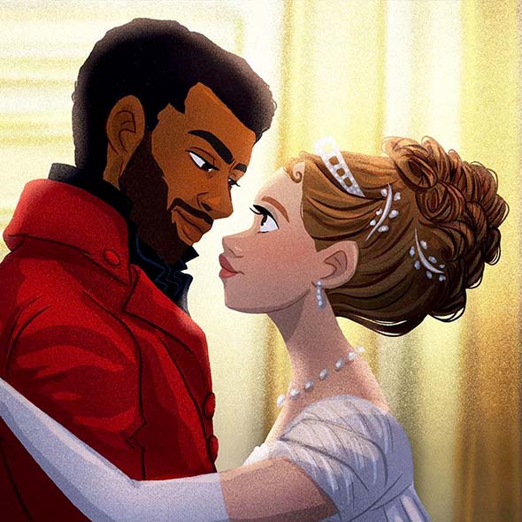
It is important to note, that due to the awesome diversity of human genetics worldwide, not many men and women will fit every one of these rules. This is great news! It means once you get a general understanding of these features, you can choose which of these masculine and feminine traits best fit your character designs!
Posing your characters correctly can be one of the most important parts of the design process. Your character’s pose can communicate a lot about their personality to your audience!
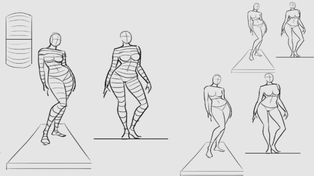
The first step towards creating amazing character poses is gesture drawing! Practicing gesture drawing from life references, movies, or photographs is a great way to make your character poses more dynamic. Here at 21 Draw, we have an awesome course that will teach you all about ‘Gesture Drawing’ and how to grow your pose drawing skills!
Some gesture drawing tips to get you started:
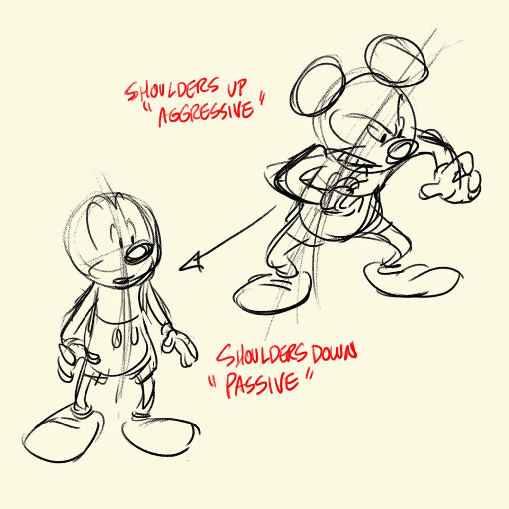
The pose you choose for your character can communicate a lot about their personality, emotions, and desires.
For example, using a concave (c-shaped,) line of action for your character’s pose can help them seem timid or sad, whereas a convex curve can be used to make them seem more confident or happy.
So, before you choose your pose, think about what you want to say about your character and how you can best illustrate this information through curves, tilts, and expressions!
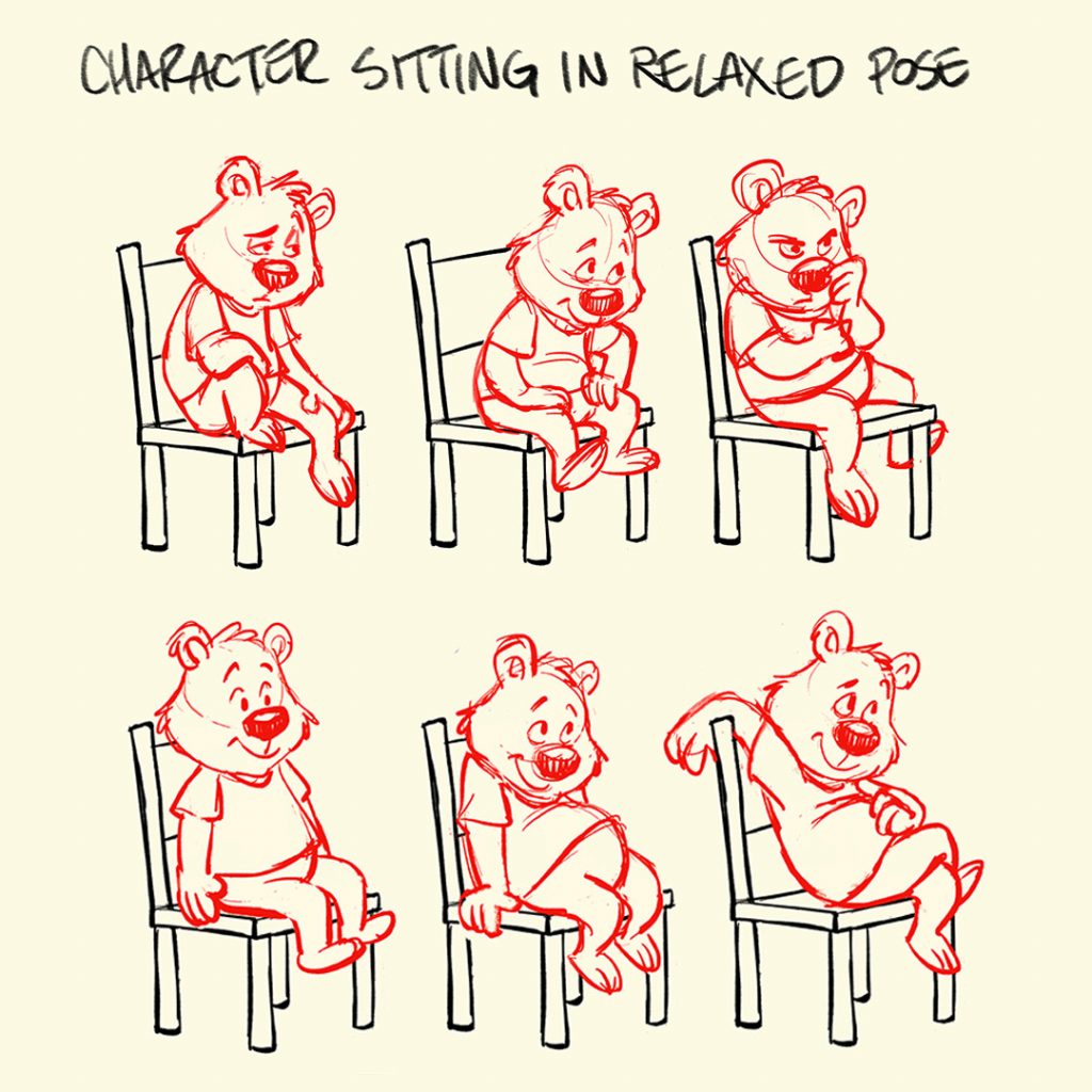
There are so many different ways you can alter your character’s pose to make it more effective. If you are interested in improving your posing, Tony Bancroft has an amazing course on ‘Drawing Character Poses with Personality’ that I highly recommend checking out!
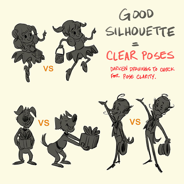
Once you have got your design nailed down, you can start thinking about how you will pose your character. An easy way to check whether or not your pose is working is to create a silhouette of the pose and see if it still reads well. Good poses are easily understandable even when silhouetted!
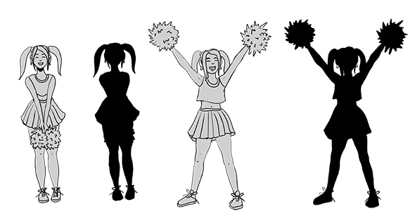
As you can see with the pose on the left, when the character’s pose is silhouetted her cheerleading pom-poms and most of her costume are obscured due to the posing, making it difficult to gain an insight into her character.
However, in the right-hand pose, her action and design remain clear even when silhouetted – communicating a lot more information about the character to the viewer.
By making strong posing choices for your characters you will greatly improve the readability of your character designs!
Have you ever worked on a piece for so long that you can’t really tell if there are mistakes anymore? It can be really difficult to see errors in your own work, so it is really important to seek out feedback!
For a lot of beginners, this feedback will come from their teachers. However, if you aren’t studying there are still a few places you can get feedback including asking friends, family, or even other artists online! There are tons of lovely artists on social media that will be happy to help you out if you ask!
Once you have your character design finalised, you will be ready to start thinking about what colours you want to use in your illustration.
The colours you choose for your character can dictate a lot about what type of character they are as well as how they will stand out against their intended environment. To help make this decision easier you may wish to choose a specific colour scheme for your design.
Talented artist Meike Schneider has amazing lessons on colour theory in her course ‘Drawing a Female Character’ that will really help you understand these colour combinations!
Here are a few of the awesome colour schemes you may wish to try out!
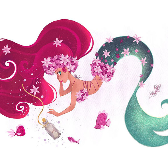
Complementary colours are the exact opposite of each other on the colour wheel. This gives a highly contrasting, bold look. If you want your character to stand out, a complementary colour scheme is perfect!
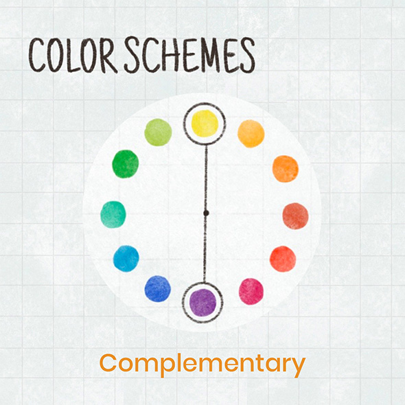
As you can see in the below example, the use of complementary colours for a character design really allows for the details to pop in the illustration! This can be a useful tool when you are creating a protagonist who needs to be the focus of your drawing.
A monochromatic colour scheme uses only the tones, tints, and shades from a single hue on the colour wheel. This creates a really unique and often emotive look in an illustration. If you are looking to make relatively simple colour choices, this could be the best method for you!
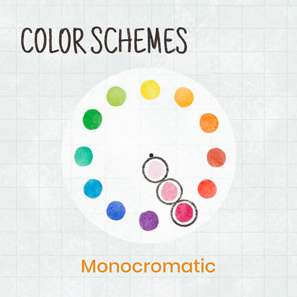
This colour scheme is great for creating characters with well-defined traits that may be best expressed through a specific colour. If you have a very complex character design, monochromatic colours can also help simplify their appearance and make it more visually appealing.
A monochromatic color scheme is also a great choice if you are looking to improve your understanding of values when colouring and shading your work!
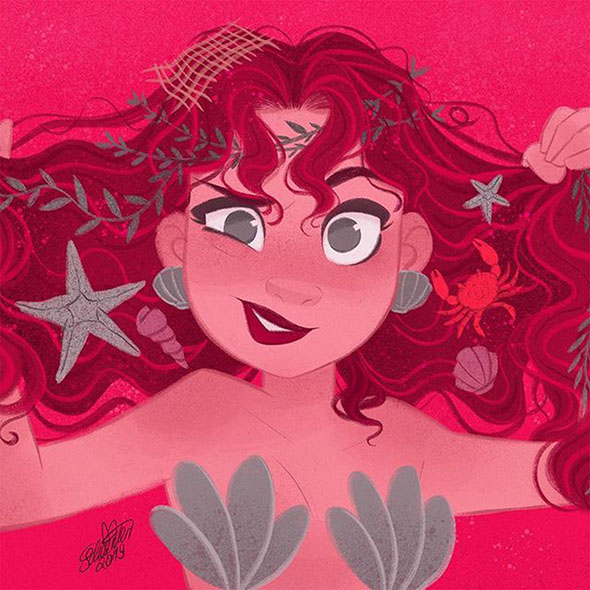
If you are looking to have a bit more variation in your colour scheme, the Triadic method might be just what you need! These colour combinations use 3 colours that are equally spaced apart on the colour wheel.
When it comes to using triadic colours, it is best to choose one of the three to be the most prominent in your illustrations and use the other 2 for highlighting smaller details.
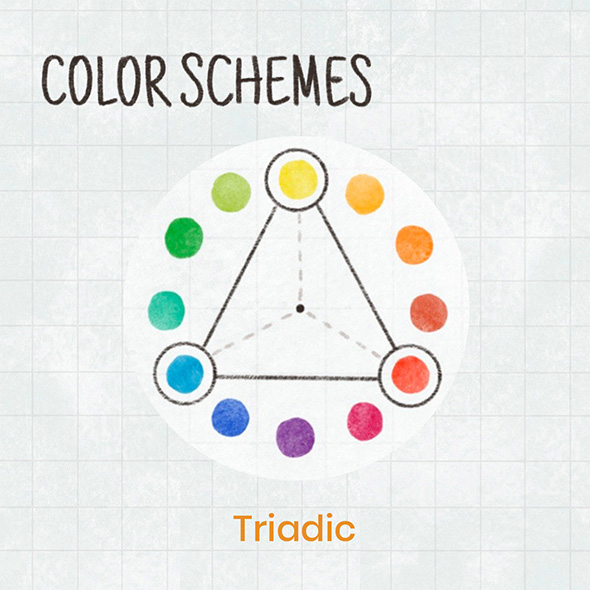
This colour scheme creates a very vibrant look, even when the colours are toned down. It is best used for characters with playful energy, as these colour combinations can often feel very youthful. This makes triadic colours perfect for characters aimed at a younger audience!
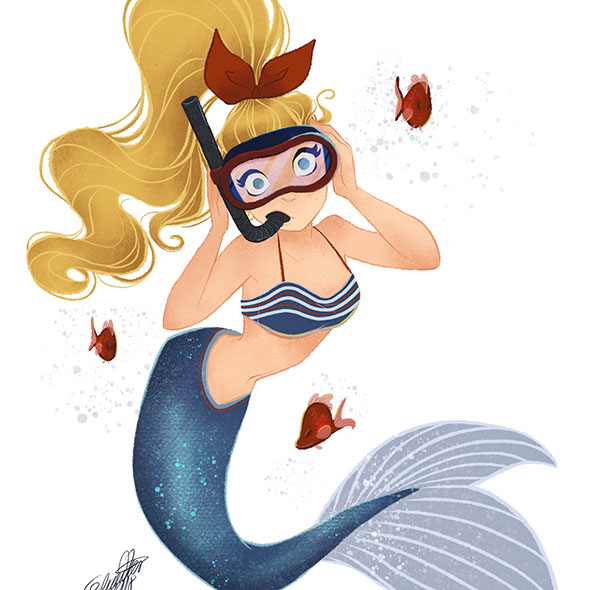
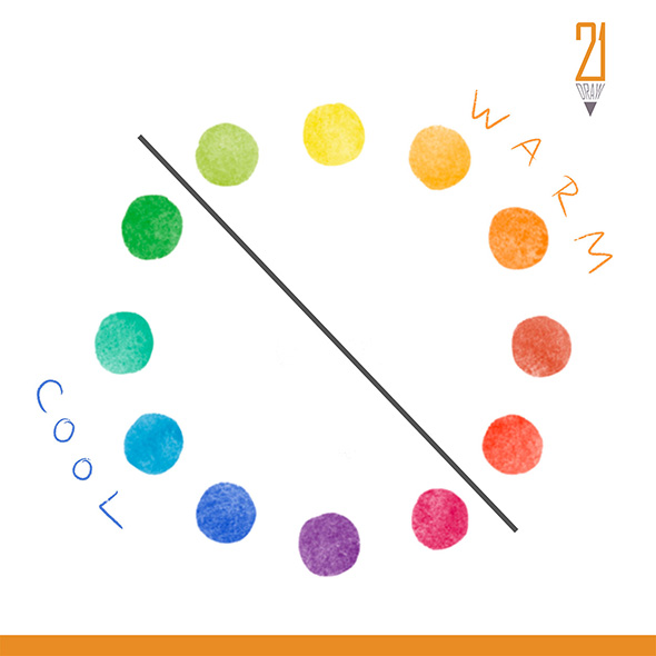
When it comes to using warm vs cool colours there are a few key things to consider. When added to an illustration, warm coloured objects will typically feel closer to the viewer, whereas cooler ones will feel further away.
This is because of atmospheric perspective, which is essentially just the effect of particles in the atmosphere making things further away have a bluish tint.
The colour temperature of your characters will have a similar effect, for example, warmer-coloured characters will stand out and feel confident, whereas cooler-toned characters may appear more closed off and mysterious.
However, just like anything else in art, these rules can be broken if you feel like experimenting to create more unexpected designs!
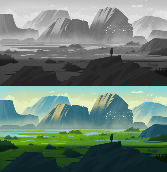
There are two main ways that artists add colour to their illustrations. The first, probably the most obvious method, is to start right away with colour or underneath your line art. This method is great for when you already know which colours you want to use and it gives a similar feel to traditional colouring or painting.
However, another colouring option is to first digitally paint your character in greyscale before using a range of colour blending layers to finalise the look of your piece.
This method allows you to experiment more with the colours in your design, whilst still achieving the correct values in your shading. If you are currently trying to improve your lighting and shading skills, I really recommend giving this method a go!co
So, now that you have all these awesome character design tips, are you ready to start creating your own characters?
If you want to learn EVEN MORE you can find the awesome courses mentioned in this post here!
Rhea is an Australian concept artist who is currently studying at Griffith University. She is passionate about spreading her love of art to others.